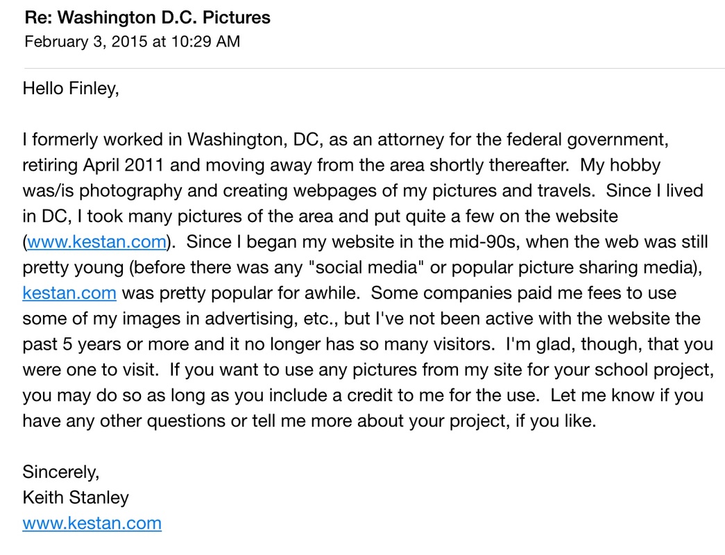
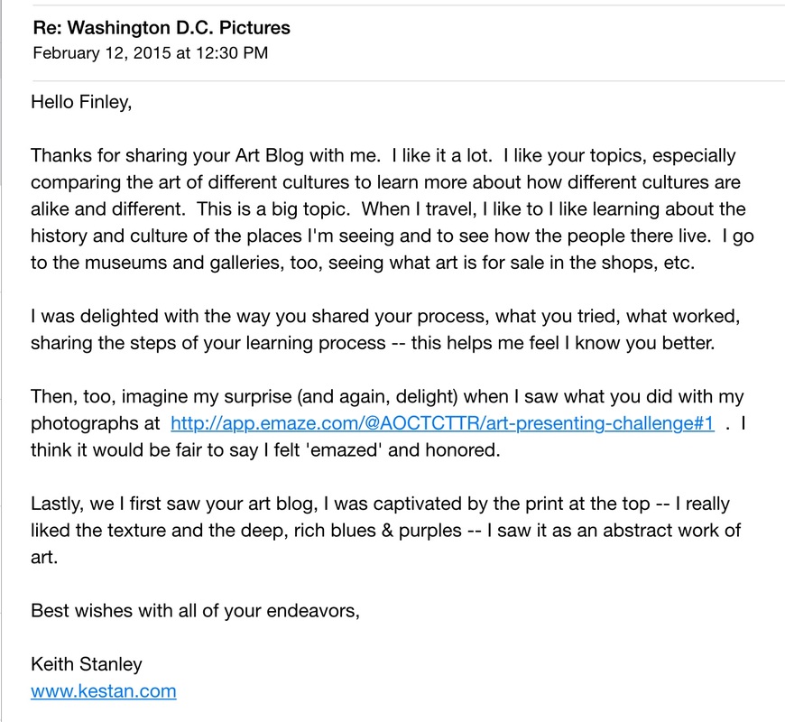
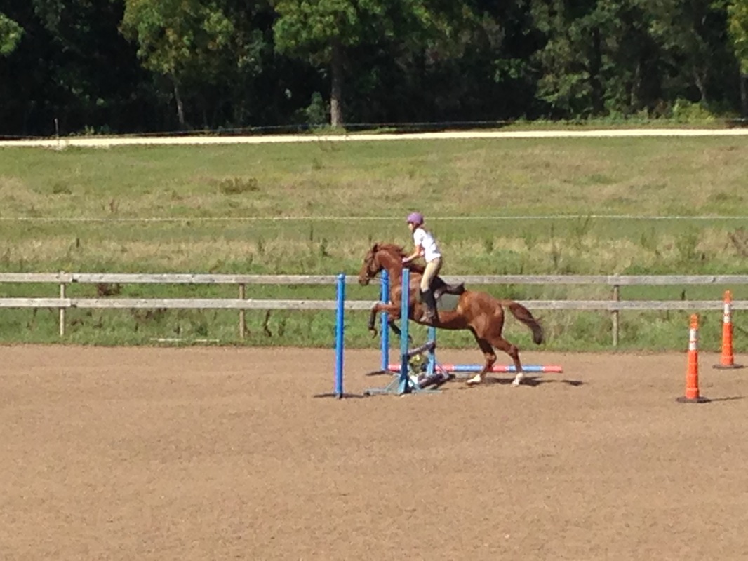
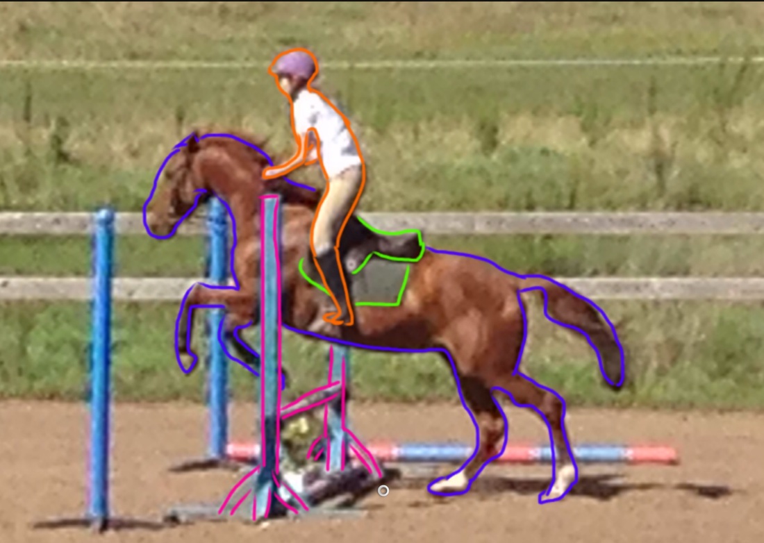
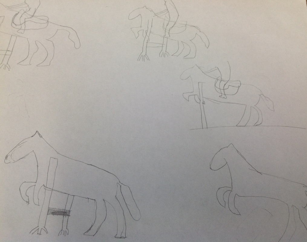
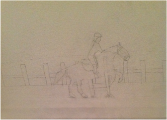
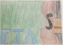
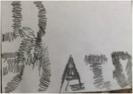
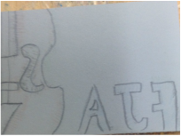
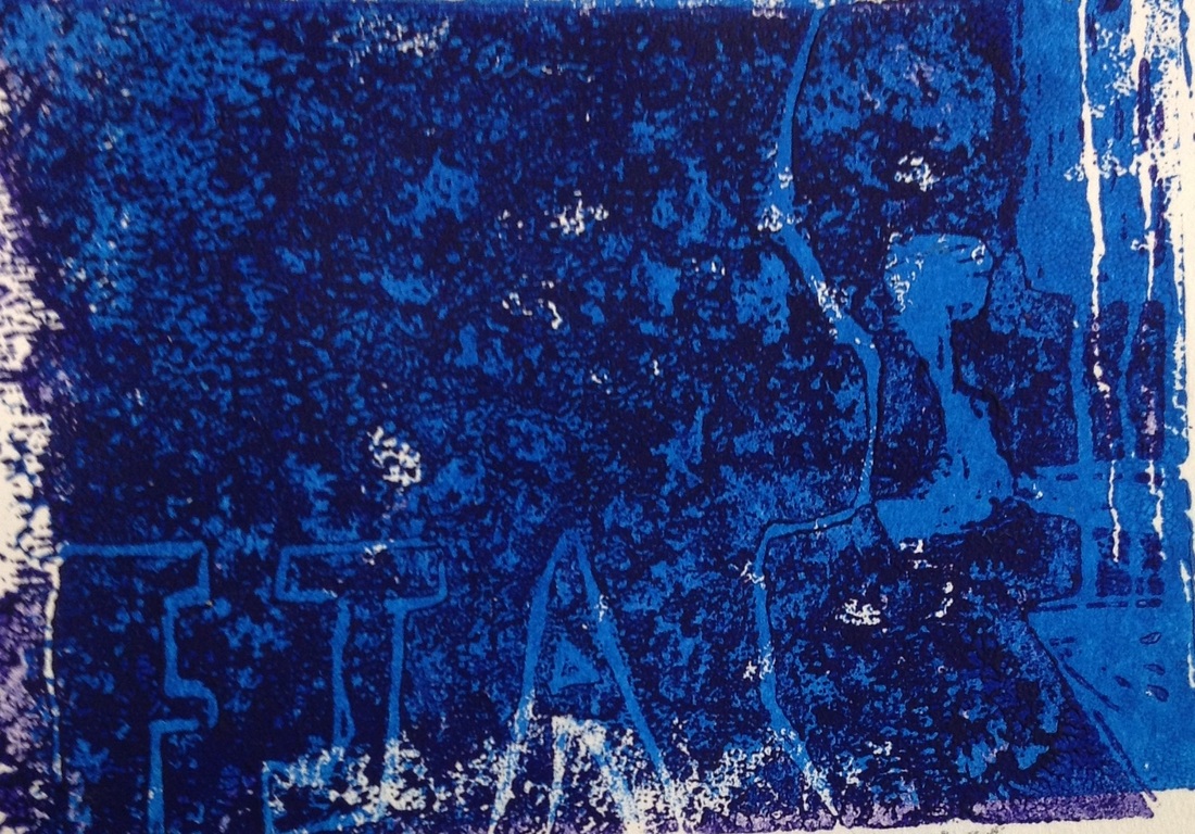
Like in my earlier Presenting Challenge Post, I had emailed Keith Stanley for information on his pictures and he responded to me. It was really helpful and when I finished my project, I sent him a link to my blog. Keith sent me back an awesome email. It was really cool to get in touch with a professional photographer.
For my graffiti tag, I made a music-themed tag with my friend Greta. We were going to do music as our tag, but shortened it down to muse. We both drew a treble clef and added the our tag around it. There was some difficulty I choosing our tag. After the tag was decided, I got some final paper an start to sketch out my idea with an eraser. Once I got it to look the way I wanted it to, I traced it with a pencil. I wrote my tag at the top of the treble clef. I then took I picture and put into an app called sketch book to test out an idea. I wanted to see if I had the treble clef black ad white if it would look good with a colored background. I thought i looked OK, but I wanted to use colors that weren't so bright. I first shaded the treble clef. Then I used a black colored pencil to add a 3D affect. I id have instruments in the background, but I erased them later. I am most proud of h treble clef and how well the 3D look worked. For my Responding Challenge, I choose to research 3 different cultures and how their art is affected by it. The 3 cultures I choose were Italy, he Midwest of the U.S., and the Aborigines from Australia. So the first thing I did to get started was I looked at a website that had to links to museums around the world.(Click here to see the website)Then I visited some of the sites to try and find information. I couldn't really find what I was looking for so I tried to search it in Google. I found a couple of really good sites that helped me complete my project.(look below for the links). The hardest part for me was actually putting the final project together. I used an app called Pic Collage. I tried to make all the pictures side by side, but then you couldn't read what they said. I learned that their are a couple parts of culture can impact your art.
For my presenting challenge, I first started off with the idea to do the second presenting challenge(later switching to the first challenge) with pictures of Washington DC. landmarks. So I Googled Washington D.C. images. I found some images I liked but I couldn't really find anything about who took the pictures. since this first plan didn't work, I tried to find Washington D.C. photography. This didn't work as i hoped it would. I keep getting photography businesses in Washington D.C. At this point I was getting a little frustrated, but then i found Keith Stanley's website. I was scrolling though and found he had posted categories of Washington D.C. pictures. i picked out some pictures based on my criteria I created for the project(Washington D.C. landmarks pictures taken in the day) and started to put them in an iMovie. This wasn't really working the way I wanted my presentation to go, so I changed it to an emaze(see above). I also email Keith Stanley and got a response which helped me with me project a ton. My project finally came together and I am very pleased with the result. Click here to view the presentation. Check out more about Keith Stanley at his website
http://www.kestan.com/ Thank you Keith for letting me use your pictures! For my art challenge, I choose the challenge yourself. I choose this because I am not the best at drawing and I wanted to improve my skills. So at first I was going to do a landscape drawing, but change to drawing a horse going over a jump. Since I couldn't draw anything, I got a picture of me jumping on my riding instructor's horse. This is the picture I used. Then I downloaded the picture into an app called Sketchbook. I traced the outline of Clifford(the horse), the jump, the saddle and saddle pad, and the rider. I used different colors for each object of the picture. My goal was to get a feel for the lines and how they all connected. I eventually did get better, but it took awhile. After I got decent at drawing this scene, I bought some canvas and started to sketch it out on that. I used a lot of eraser to get it the way I wanted it to look. It looked too empty with just the horse, jump, and rider so I added a hill and fence in the background, like in the original picture. I thought about adding a quote, but dropped that idea later. Now it was time it start painting. I started with the hill. It took a couple of coats to get all the brush strokes away. Then I painted the fence, and the ground. I also painted the sky around this time. Once this was dry, I started painting the horse, saddle and bridle, and the rider. I think the rider was the hardest for me just because of my drawing skills before this project. So this is my final picture. I am really proud of how well I did on it and how much my skills have improved. I learned more about the different perspectives that can be in one picture or painting.
My 2D poject is of a violin playing music. To start my project, I sketched out an idea of what I wanted. Then I Googled how on draw a violin. I tried drawing a violin from the videos, but the violin wasn't at the angle I wanted it at. So I took a picture of me holding my violin in playing position. I tried to draw it by looking at the picture, but it wasn't working. So I put the image and a clean sheet of paper on a light table and traced it. It worked a lot better. On the rough draft I traced, I started to draw what I wanted the music notes to look like. I lightly drew a line so I knew where to put the notes. I started out small by the violin ad made the notes bigger as I got further away from the violin. I also tried out some ways to write the quote i wanted to put on my project. . My logo design is a violin and my initials. I choose a violin because I love to play my violin. I only put half of it so it wouldn't be my whole logo and I could add something else.
My print design is of a violin and my initials. To make my print, I first had to sketch it on paper. Then I did a pencil transfer to get the design on my Linoleum block. I carved out what I wanted to be white, which was the violin strings. I then took blue ink and put it on my Linoleum block. I pressed it down a sheet of paper. It didn't work the first couple of times, but I got better as I printed more. After I printed blue, I washed off my block and carved out anything I wanted to stay blue. So I carved out the bridge, fingerboard and f holes of the violin and around my initials. I took purple ink this time and inked the block. I printed on top of the blue to makes the shapes appear. The first tries didn't work, but I got better the more I did it.
This is my final print. |